Introduction
It has been a really non impressive quiet week in the Bitcoin market as volatility continues to seep out, and prices squeeze into a tight consolidation ranges with low volume. It is starting to feel like the calm before the storm as muted and quiet activity appears across both spot, derivative, and on-chain metrics. This week we will explore a broad range of metrics and indicators across the entire Bitcoin market to establish overall sentiment, volatility triggers, and models for investor behavior.
Below we can see a summary of the BTC on chain data:
- BTC Active Address: 819,200, up 0.34%
- BTC On-Chain TX Vol: 375,200 BTC, down 9.19%
- On-Chain Transactions: 231,800, up 5.84%
Note: The situation on BTC seems to slightly improve.
Macro Outlook
It looks like there is an on going hash-rate recovery, that may suggest that offline miners have successfully relocated or re-established their hardware, recovering costs and likely reducing the risk of treasury liquidation sell-pressure. Also slow hash-rate recovery may suggest the converse, where costs and outage continues to take a financial toll, and thus increases the risk of treasury sales [1].
This week, the hash-rate has recovered from the peak-trough decline of 55%, to around a 39% decline. Should this level hold and be representative, it would indicate that hash-power equivalent to around ~29% of the affected hash-power has come back online [1].
Below we can see the hash-rate charts (all time chart):
Note: Near the end of the chart we can see the BTC all time slow recovery.
Below we can see the hash-rate charts (monthly chart):
Note: Near the end of the chart we can see the BTC monthly recovery.
Below we can see the addresses holding more than 10K of BTC (two week chart):
Note: This chart movement indicates nothing more then consolidation for BTC.
Below we can see the annual NUPL chart of BTC (annual chart):
Note: This annual NUPL chart shows that BTC is still healthy and looks good. Net Unrealized Profit/Loss (NUPL) is the difference between Relative Unrealized Profit and Relative Unrealized Loss. This metric can also be calculated by subtracting realized cap from market cap, and dividing the result by the market cap.
Below we can see the annual aSOPR chart of BTC (annual chart):
Note: The Spent Output Profit Ratio (SOPR) is computed by dividing the realized value (in USD) divided by the value at creation (USD) of a spent output. Or simply: price sold / price paid. This metric was created by Renato Shirakashi. The adjusted SOPR is SOPR ignoring all outputs with a lifespan of less than 1 hour. aSOPR is used to identify the local and global tops and bottoms (e.g. weekly and annual tops and bottoms etc.). The chart shows BTC got "reset", and that potentially indicates the Bull trend violently interrupted, in one small Bear trend and potentially a second Bull trend (aka. the Bull run was split on to two Bull trends).
Below we can see the annual aSOPR chart against the BTC price:
Note: In this chart we can see how aSOPR maps tops and bottoms.
Below we can see the addresses holding more than 10K against the BTC price (daily chart):
Note: This chart is showing the addresses holding more than 10K against the BTC price and I am also marking the entry of Elon Musk. We can clearly see the Elon Musk bought at 32-33k, and that is the end point of the accumulation phase and the start of the distribution phase (also known to Wycoff distribution). For more information see this post and this post. I made a mistake in the second post about the entry of Elon Musk. Elon Musk entered at 32-33k as already stated, not 35k.
Micro Outlook
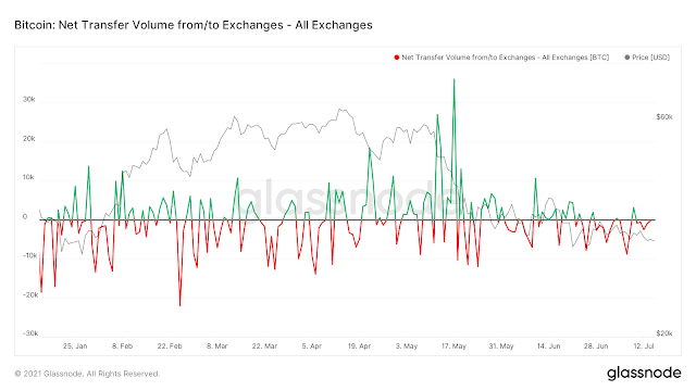
Key theme throughout, the whole, 2020 and Q1 2021 was the relentless depletion of exchange coin reserves, with many of them en route to the Grayscale GBTC Trust, or accumulated by institutions. Now we see the outflow again increasing (an Bullish indicator).
Below we can see the exchange net-flow charts (six month chart):
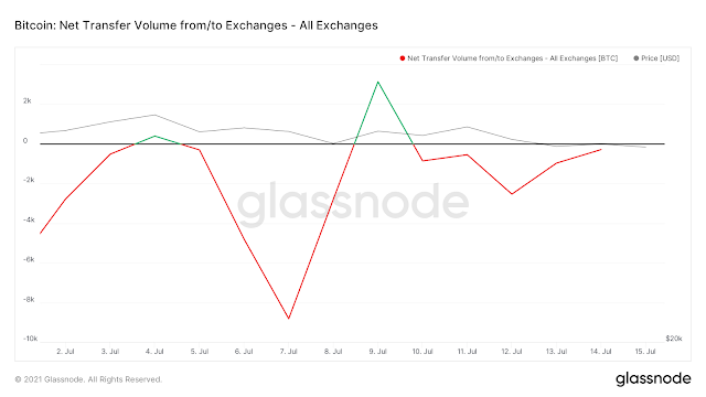
Below we can see the exchange net-flow charts (two week chart):
Note: The inflow movement decreased, even more the last two. This potentially indicate a BTC upward movement.
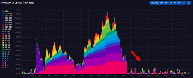
Below we can see the BTC mempool charts (one month chart):
Note: The mempool chart , verifies the low BTC volume for the last month. Again this chart movement too indicates nothing more then consolidation for BTC.
Conclusion
Technically speaking I see more consolidation on the BTC price. Nothing much has changed since the last post. It looks like there is going to be some big move.
Below we can see the USDT distribution in top 1% addresses chart against the BTC price (daily chart):
Note: The reason I am showing that is because, it means that someone is deploying USDT for future purchases. It does look reasonable since the Wycoff distribution is finished and we are now in a face of a Wycoff re-accumulation phase. It seems someone is on vacation.
References:


No comments:
Post a Comment